#Goals
Re-visualizing the relationship between fashion and sustainable development
BRIEF
This project was for an information design studio class. The concept was to analyze and critique an existing piece of information design or data visualization of our choosing. Our analysis would form the basis of a redesign of the original work, from which we would propose an alternate solution that addressed the shortcomings we identified.
I selected Giorgia Lupi’s Capstones, an installation in the MoMA exhibit entitled Items: Is Fashion Modern? I wanted to reinterpret the principles of data humanism inherent in the original visualization with a greater focus on legibility and user experience.
ANALYSIS
The original visualization is organized in a grid structure, with data portraits and labels of 8 key items arranged horizontally and 15 areas of impact related to a fashion item’s production and consumption are listed along the y-axis. For each key item, if an area of impact related to its commercial lifecycle could be redesigned to meet one of the 17 Sustainable Development Goals, the symbol of that goal (defined in a legend to the left of the visualization) appears at the intersection of the item and the area.
Each SDG symbol is simple and unique, arranged together in small clusters. The design and arrangement of these symbols is lyrical, but I found it difficult to read as a data visualization. Because there are 17 different goals, it is hard to imagine a viewer, even a very motivated one, memorizing all of them and accurately spotting them as part of these clusters.
ACCESS *
* This visualization is a working design best experienced in Chrome or Safari on a computer
original visualization by Giorgia Lupi
DATA
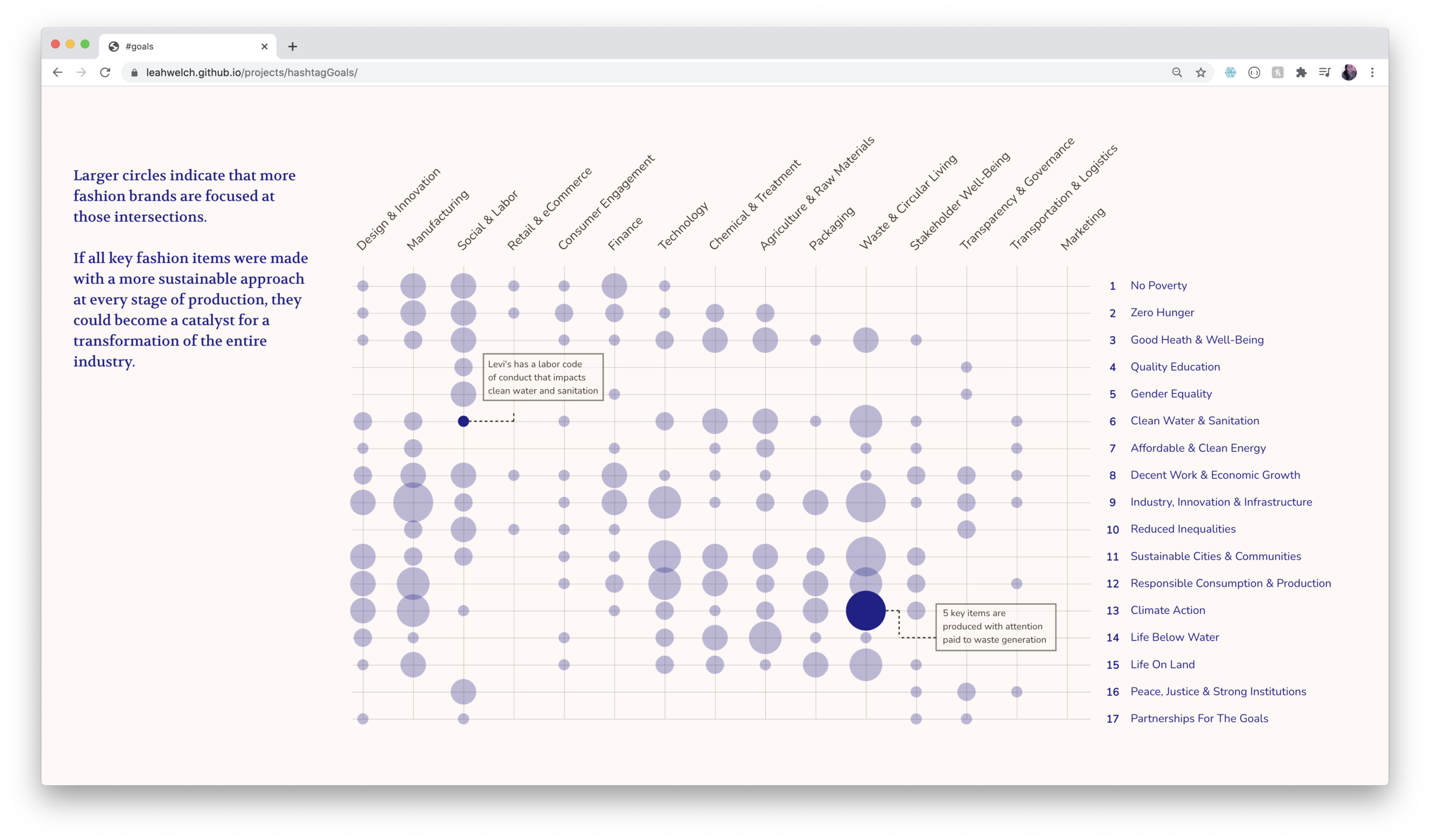
My entry-point was to represent the relationships between 3 variables: 8 Key Items, 15 Areas of Impact, and 17 Sustainable Development Goals (SDGs).
I built the dataset by hand from the original visualization. In order to simplify the visual mapping, I converted the Key Items variable from selective (which Items map to intersections of Industries and Goals) to quantitative (how many Items map to intersections of Industries and Goals). I also added a layer of categorical organization to the SDGs, sorting them into the Planet, People, and Prosperity groups defined by the U.N.
DELIVERABLE
Scrolling data story
There is some ambiguity about the meaning of these points of intersection. Do they highlight existing problems, describe opportunities for improvement, or reveal how certain industries are already working toward sustainability? It seemed most likely that points of intersection were a good thing, so I drafted my data story around where intersections were the most active (largest circles) and where they were totally inactive (no circles).
Storytelling
Because of the limited nature of the data, I had to take a high-level approach to the design: it couldn't offer any answers, but it could raise questions. My intended audience is consumers, especially those who are curious about the sustainable impact of their purchases.
I chose the medium of scrollytelling to control the pace of the narrative, grounding the reader in the overall context of the data before revealing the patterns that I found the most meaningful.
I used the Waypoints scrolling library to create this visualization.


