The Language of Obesity
A text analysis of YouTube video descriptions about obesity around the world
BRIEF
This project was for a design mapping strategies class aimed at visualizing the complexity of the food system in partnership with the Future Food Institute. The concept was to explore the public discourse around food, creating a narrative data experience intended for public engagement.
DATA
YouTube keyword searches about obesity in Kuwait, Mexico, and Tonga formed the basis of the data collection. While these 3 countries all face rising obesity rates, I selected them to test my hypothesis about a hidden connection between them: the availability of American junk food and its transformation of their culinary cultures.
From these initial searches, I scraped the descriptions of over 2500 videos and split each description into a comma-separated list of individual words. For each country, I compiled every description word and sorted the top-occurring words by 10 common themes.
DELIVERABLES
Communicative posters providing an analysis of the data for each country
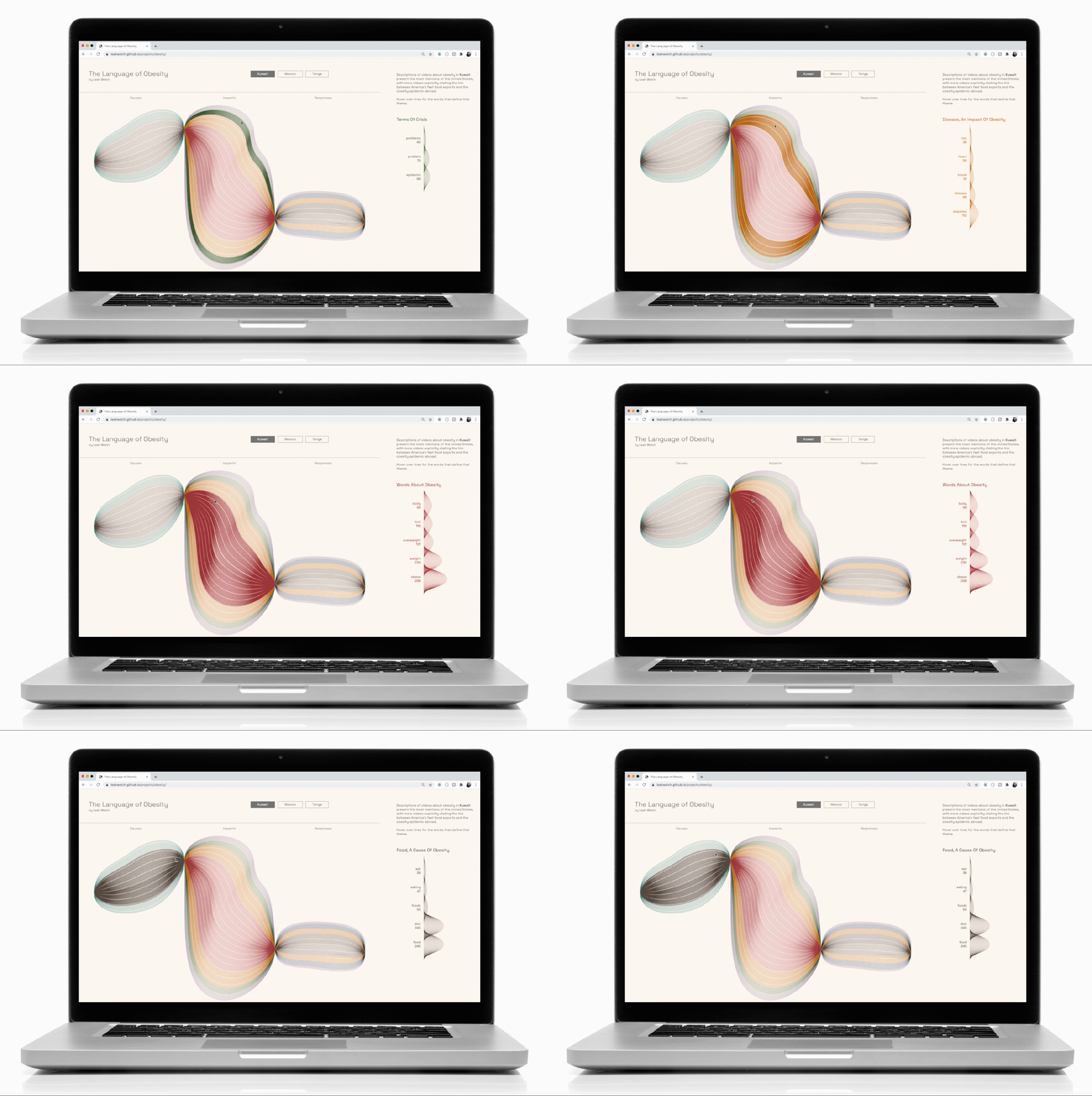
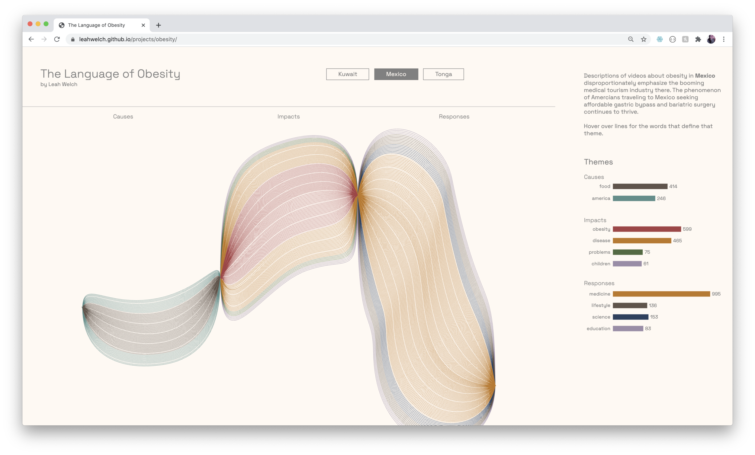
Web interface synthesizing all 3 countries with details-on-demand
ACCESS *
* This visualization is a working design best experienced in Chrome or Safari on a computer
Visual Language
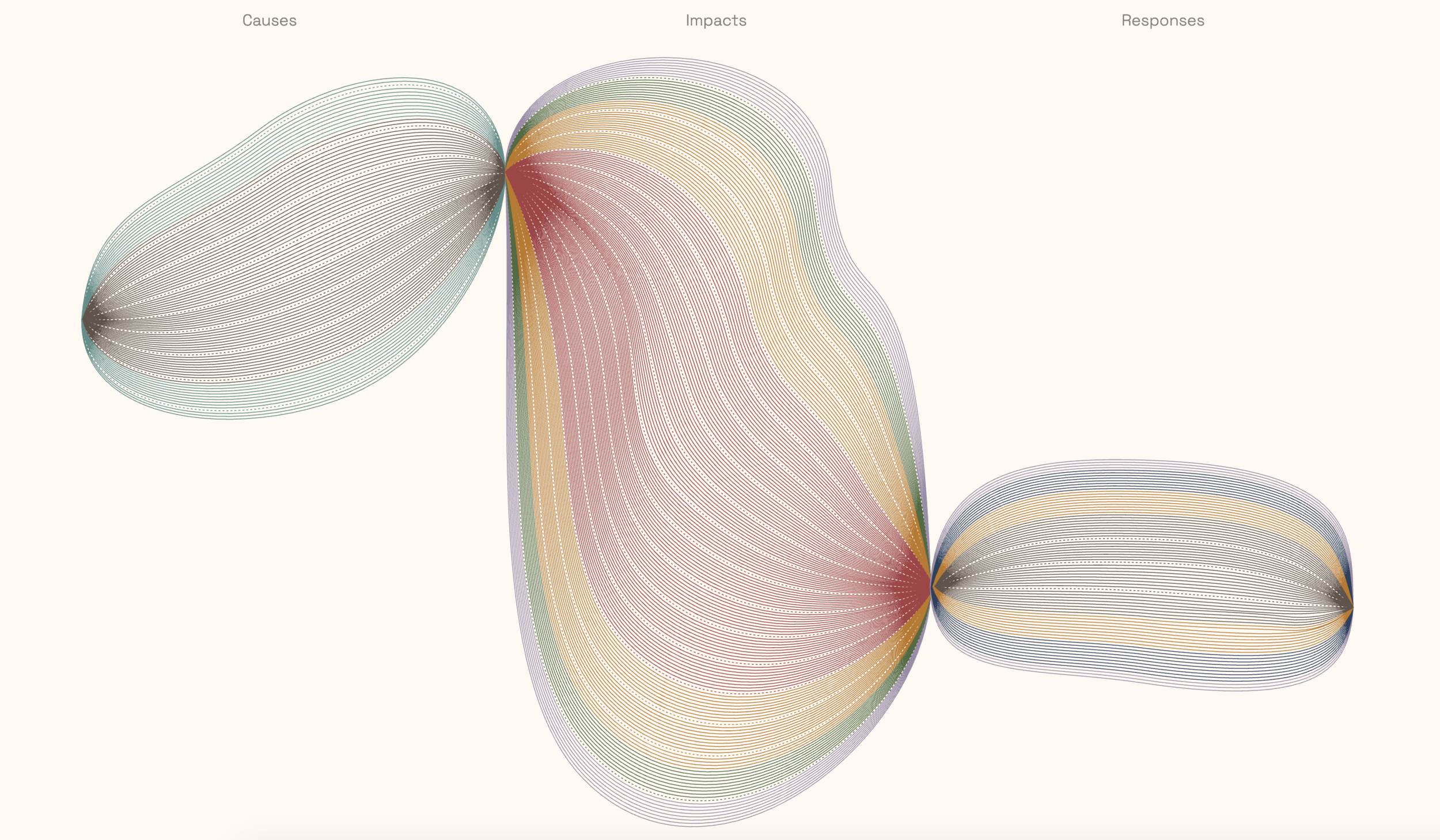
One of the challenges of the brief was to make effective use of visual metaphor when communicating the data. In order to organize the data for high visual impact and make the narrative memorable, I devised a grammar based on an art project that I loved from elementary school: drawing thin black lines that looped around the page. The technique created dimensionality through the darkened pinch points where the pen repeatedly covered the surface of the paper.
The resulting drawing always felt like it was bursting from the space of the paper, which seemed like a good starting point for visualizing data about obesity.
I created SVG shapes in Illustrator by dividing the canvas into 3 equal sections for Causes, Impacts, and Responses. These would function as the pinch points for my shapes. I drew freehand lines for each country and built the outer forms around them by distorting basic ellipse shapes. Using the Blend tool, I created lines that corresponding to the total number of words in each section divided by 10, then broke out the sections by individual theme.
To help mitigate the moiré pattern created by the repetition of thin lines, I color-coded the themes and used dotted lines to break the forms up every 10 lines (100 instances of a word in that theme).
an initial sketch based on a third-grade art project: the repetitive drawing of lines that met at pre-determined pinch points
a chunk of lines grouped by theme
Key Code Blocks
It was really important to me that users could interact with and explore these diagrams. Using d3.xml, I loaded my 3 main SVG files and modified the structure of each inside the code itself.
I created a hierarchy of <g> elements for each file. At the top is the parent <g> that held all of the layers. This enabled me to grab all of the paths in the image and append them to the SVG canvas.
Inside this parent element lived the <g> elements automatically created from the Illustrator layers, which corresponded to the linguistic themes of the text analysis. I created sub-groups within these for the solid and dotted lines to enable more stylistic control. Finally, I added invisible paths on top of each themed <g> element that covered the area of the color-coded groups of lines. These functioned as hotspots so that the user could smoothly mouse over each group as a whole.
These ‘.mouse’ paths were a critical component to enabling a positive user experience; without them the movement of the mouse from one line to the next triggered a sort of flickering effect that detracted from the interface.
I created a list of themes and their word counts, which I then used to generate a 2-dimensional array of small SVG images for the supplemental density charts that would appear on mouseover:
To bind the data to the interactions so that the top-occurring words and their quantities appeared when the user hovered over a group of lines, I filtered the data according to the class associated with each thematic <g> element:


